Generative AI Lab enables you to configure labeling interfaces using either XML-like tags or a Visual Menu Builder that automatically generates these configurations through an intuitive UI.
This flexibility allows both technical and non-technical users to define how annotation tasks are displayed and labeled.
The Lab supports three main types of tags for managing labeling logic and display:
- Object tags define the data type to be labeled — such as text, image, audio, video, HTML, or PDF.
- Control tags define the annotation actions applied to objects — for example, using
Labelsfor entity recognition orChoicesfor classification. - Visual tags adjust the appearance or structure of the labeling interface, such as adding headers or layout controls.
Available Project Types
Generative AI Lab supports a wide range of project templates designed to cover diverse annotation and evaluation workflows.
These include traditional types such as Text, Image, Audio, Video, and PDF projects, as well as De-Identification projects for anonymizing sensitive data.
In addition, specialized templates are available for advanced use cases, including:
- LLM Evaluation Projects – for assessing and comparing outputs from different Large Language Models (LLMs) across prompts and criteria such as accuracy, coherence, and safety.
- HCC Risk Adjustment Coding Projects – for mapping medical findings to Hierarchical Condition Category (HCC) codes, supporting clinical coding and risk adjustment use cases.
These specialized templates expand the Lab’s capabilities beyond standard annotation, allowing teams to perform model evaluation and domain-specific coding within the same unified interface.
Custom Labeling Configuration
A name parameter is required for each Control and Object tag. Every Control tag also needs a toName parameter that matches the name parameter of the object tag in the configuration. Suppose you wish to assign labels to text for a Named Entity Recognition task. In that case, you could use the following labeling configuration:
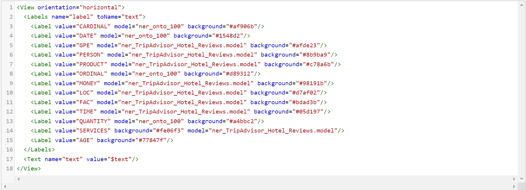
In this case, text is annotated using the Label tags in combination with the Text tag. Multiple control and Object tags may be used in the same configuration by creating linkages between them using names.
Variables
All Object tags, as well as some Control and Visual tags, support variables within their arguments. Using variables enables for the creation of a labeling configuration, while also allowing for the control of given information on the labeling interface based on data in a given task.
To use a variable, define it with the value parameter of a tag and specify it using the $ sign and the name of the field that you want to reference. For example, if you have a sample task which contains some partial JSON, then the configuration should look something like this:

When you look on the preview window, you can see the header set on top of the labels/choices.
Configure project using Visual Menu Builder
Generative AI Lab includes a Visual Menu Builder that lets you configure projects without writing XML manually. This tool provides a simple, interactive way to add, edit, and organize labeling elements while still following the same XML structure behind the scenes. It’s ideal for users who prefer a no-code interface but still want the flexibility and precision of custom configurations.
To see the structure of a project configuration XML file and the definitions of the supported tag types and various parameters and variables, and to better understand how Visual Menu Builder maps and creates these elements when configuring your project, see Project Configuration Overview.
Key Features:
Add New Element
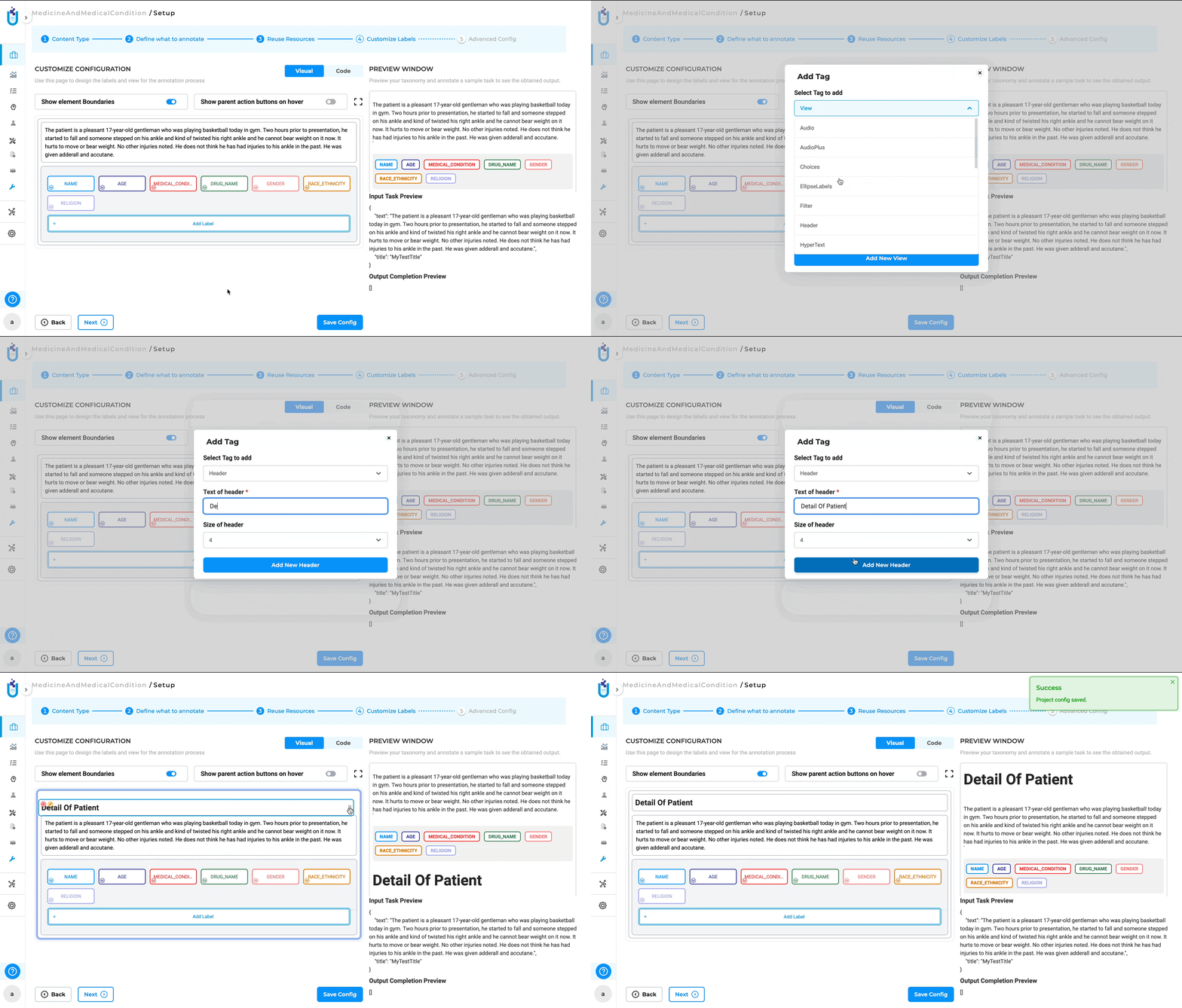
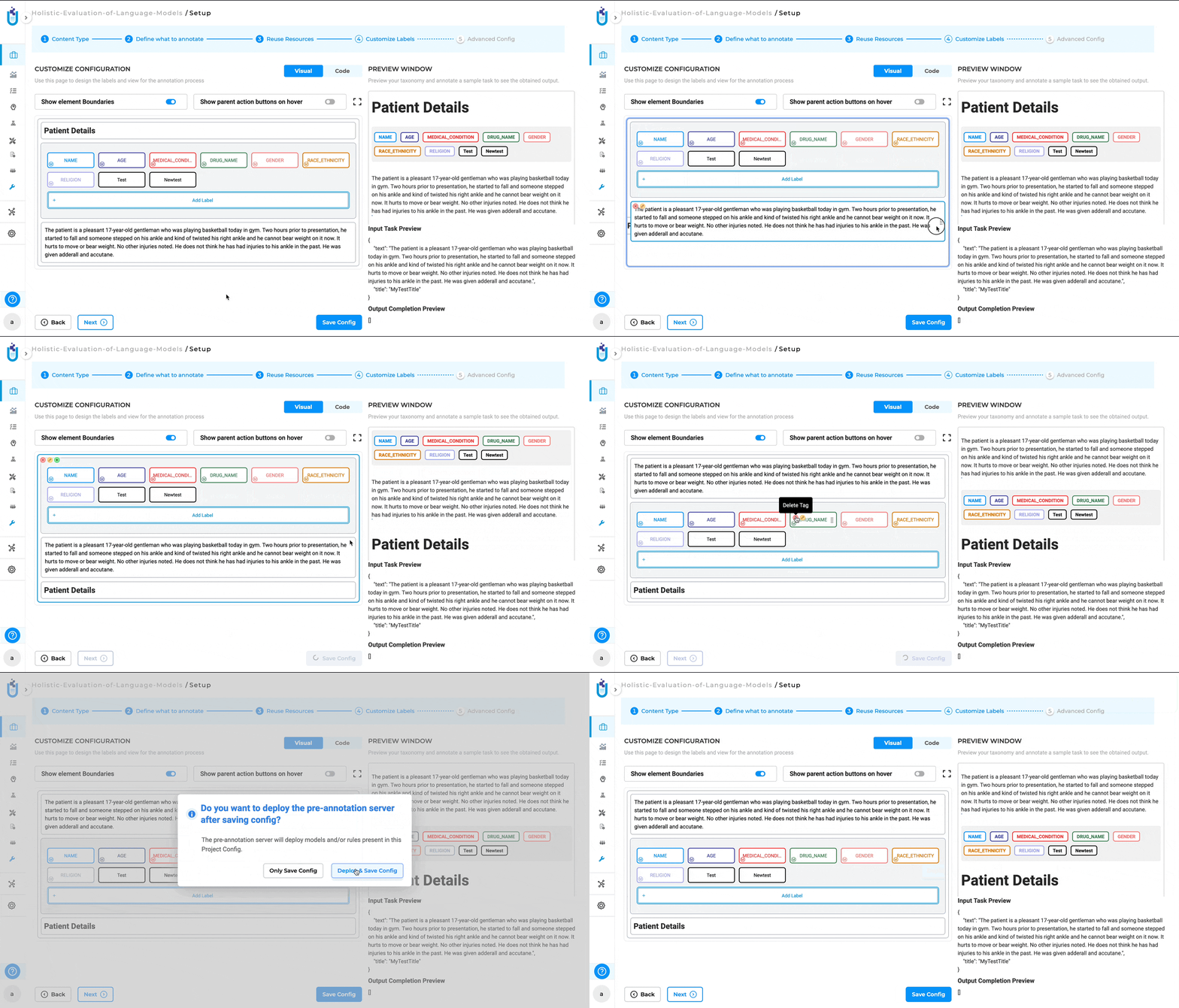
The new menu user interface allows users to easily add new elements to their project configurations. Users can click on the plus icon (“+”) within the Visual Menu Builder interface to add a new element. Once the element is added, users can further customize it by configuring additional parameters directly in the interface. This might include setting attributes, defining properties, or linking to other project components.
Edit an Element
Users can modify the properties and configurations of existing elements within the project. By clicking on the edit icon (a pencil icon), users can access the settings for an existing element. This opens an editable interface where users can adjust the element’s parameters to suit the evolving needs of the project.

Delete an Element
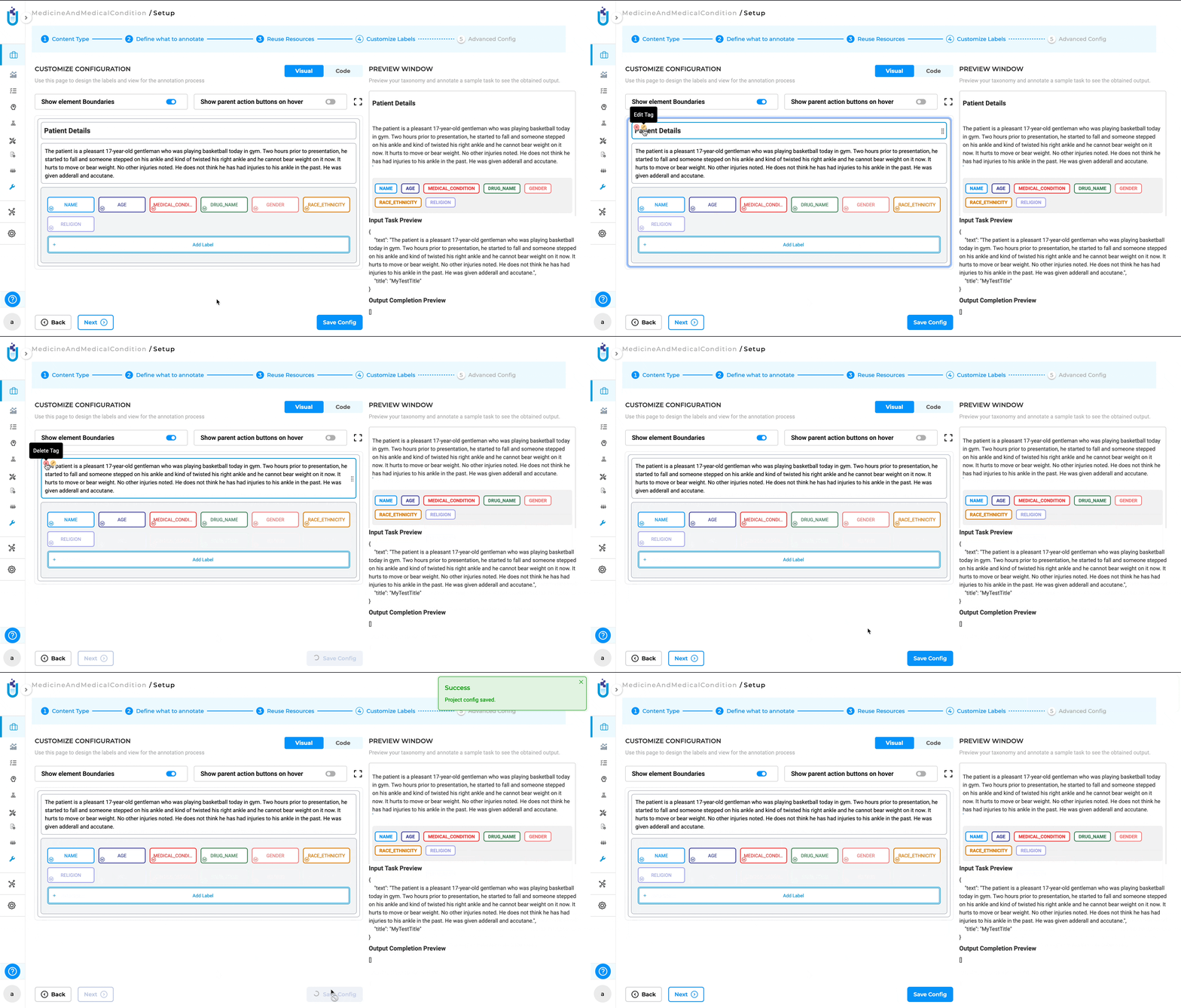
Users can remove unwanted elements from the project configuration. Users can click on the cross button (“x”) associated with a specific element to remove it from the project. This feature helps in keeping the project configuration clean and relevant by allowing users to easily remove elements that are no longer needed.
Drag and Move Element
The new visual menu builder allows users to easily rearrange elements within the project configuration using a drag-and-drop interface. To move an element, users can click and hold on the “Handle” icon, which is represented by a set of six dots (three parallel dots in two vertical rows) next to the element. After clicking on the Handle, users can drag the element to the desired position within the project configuration. Release the mouse button to drop the element in its new location. This feature provides flexibility in organizing the project structure, allowing users to quickly and intuitively reorder elements.
Show Element Boundaries
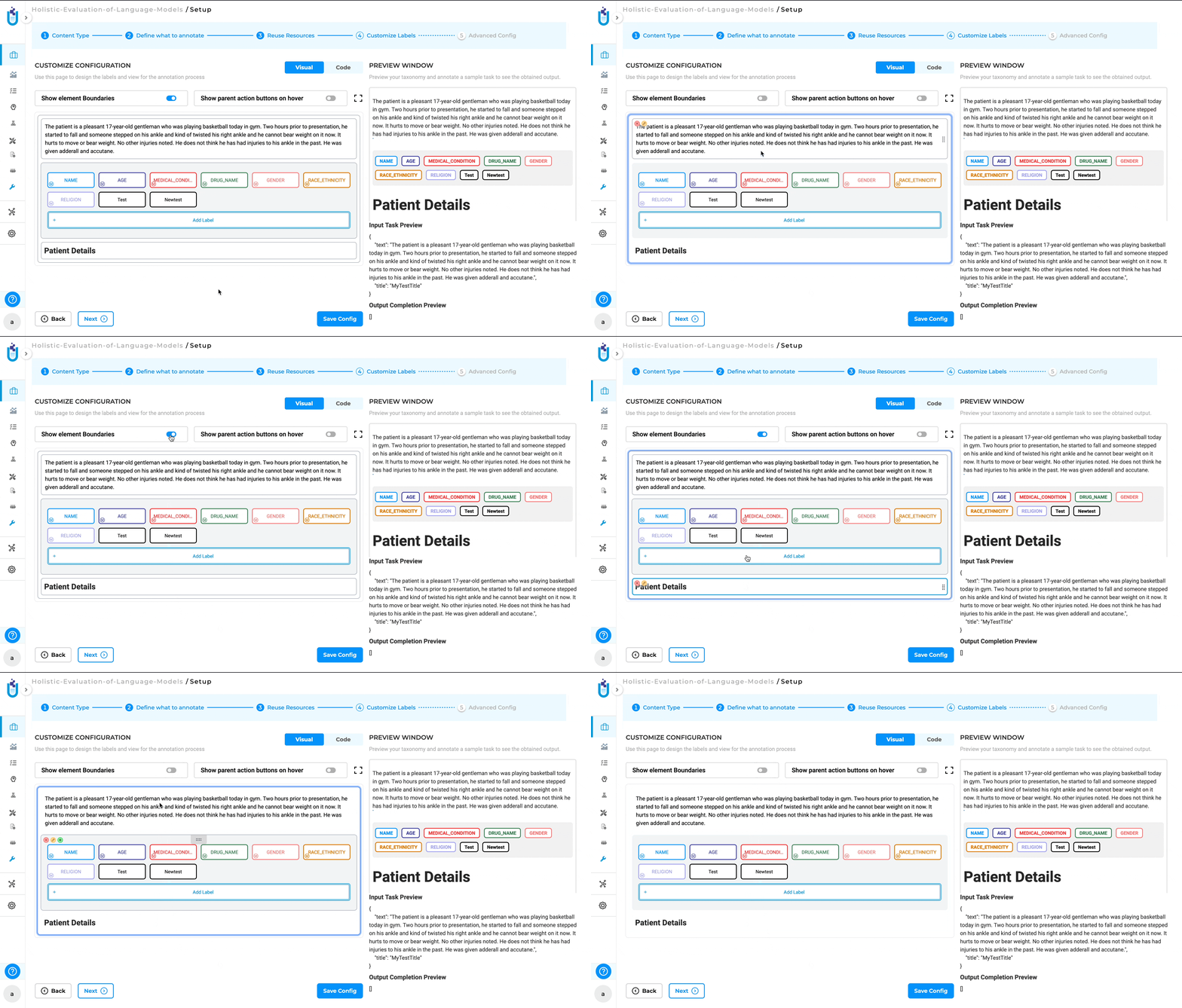
The Show element Boundaries button in the visual menu builder highlights the borders of each element within the project configuration, making it easier to visualize and distinguish the different components. By clicking on the “Show element Boundaries” button, users can toggle the visibility of the boundaries for all elements in the configuration. When enabled, a visible border will appear around each element, clearly outlining its scope and separation from other elements. This feature is particularly helpful when working with complex configurations where multiple elements are closely positioned. By showing the boundaries, users can easily identify and select the correct element they want to edit, move, or delete.
Show Parent Action Buttons on Hover
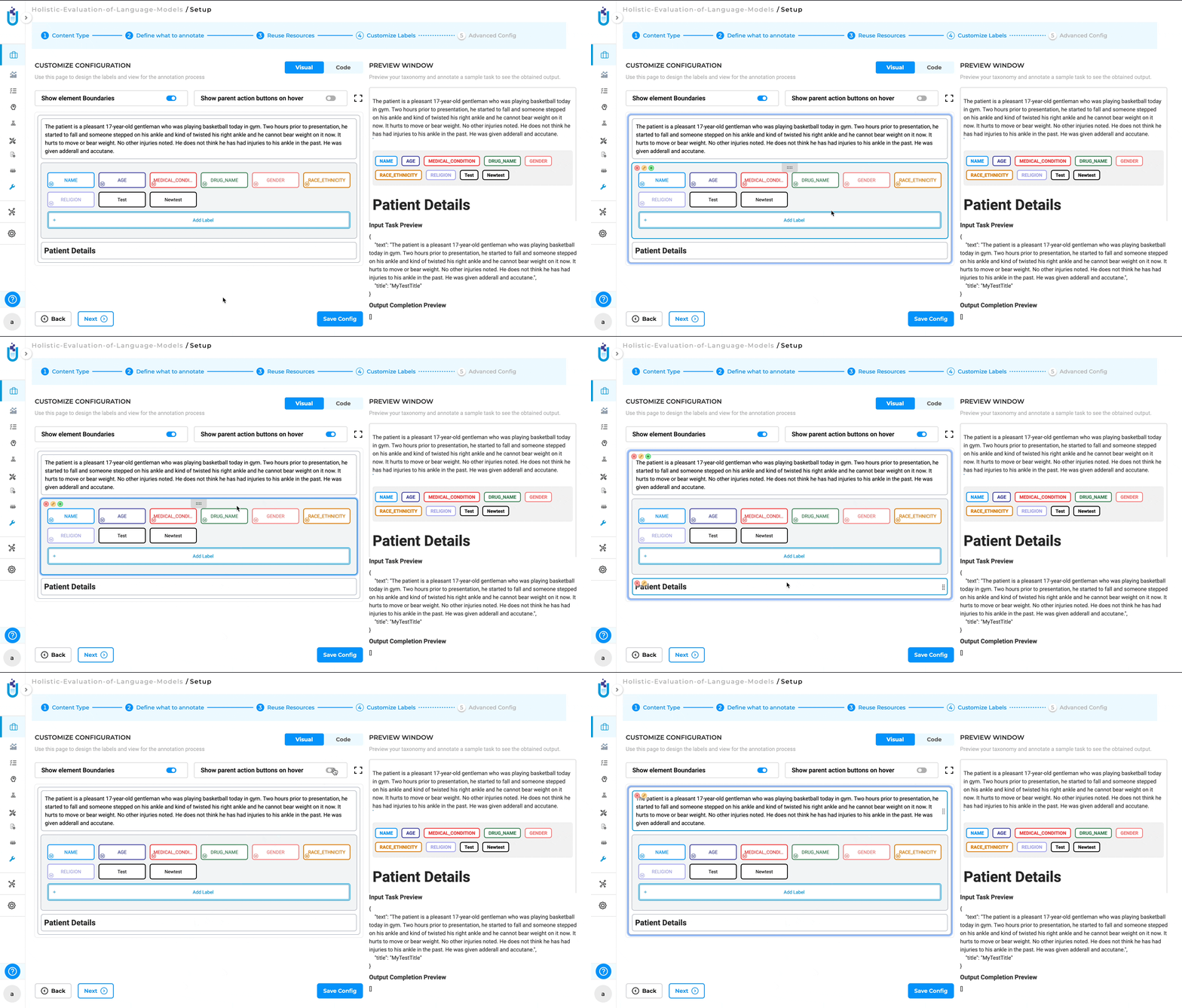
The Show parent action buttons on hover button in the Visual Menu Builder allows users to quickly access action buttons (such as edit, delete, or add) for parent elements by hovering over them. By hiding the action buttons until needed, it reduces visual clutter and allows users to concentrate on their current tasks. The ability to quickly access these buttons by hovering ensures that they remain easily accessible without overwhelming the interface.
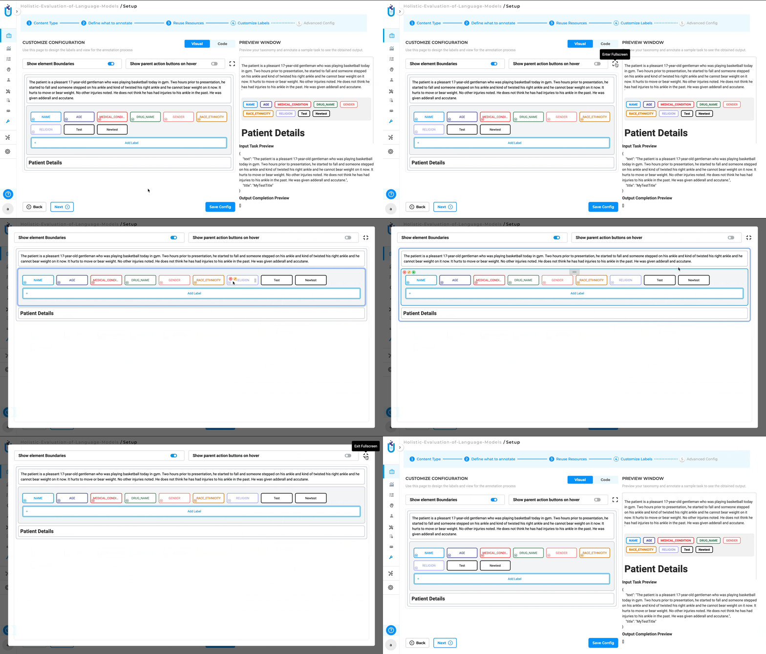
Fullscreen Mode
The “Fullscreen” button in the visual menu builder allows users to expand the workspace to occupy the entire screen, providing a larger and more focused view of the project configuration. Clicking on the “Fullscreen” button maximizes the Visual Menu Builder, hiding other UI elements so the entire screen is dedicated to the project configuration. To exit fullscreen mode, users can click the “Fullscreen” button again or use the Esc key to return to the normal view with all standard UI elements visible.
