Generative AI Lab supports multiple predefined project configurations such as Text Classification, Named Entity Recognition (NER), Visual NER, LLM Evaluation, and HCC Coding. Create a setup from scratch or customize a predefined one according to your needs.
For customizing a predefined configuration, click on the corresponding link in the table above and then navigate to the Labeling configuration tab and manually edit or update it to contain the labels you want.
After you finish editing the labels you want to define for your project click the “Save” button.
Project templates
Generative AI Lab includes multiple predefined project configurations such as Text Classification, Named Entity Recognition, Visual NER, LLM Evaluation, and HCC Coding.
Content Type
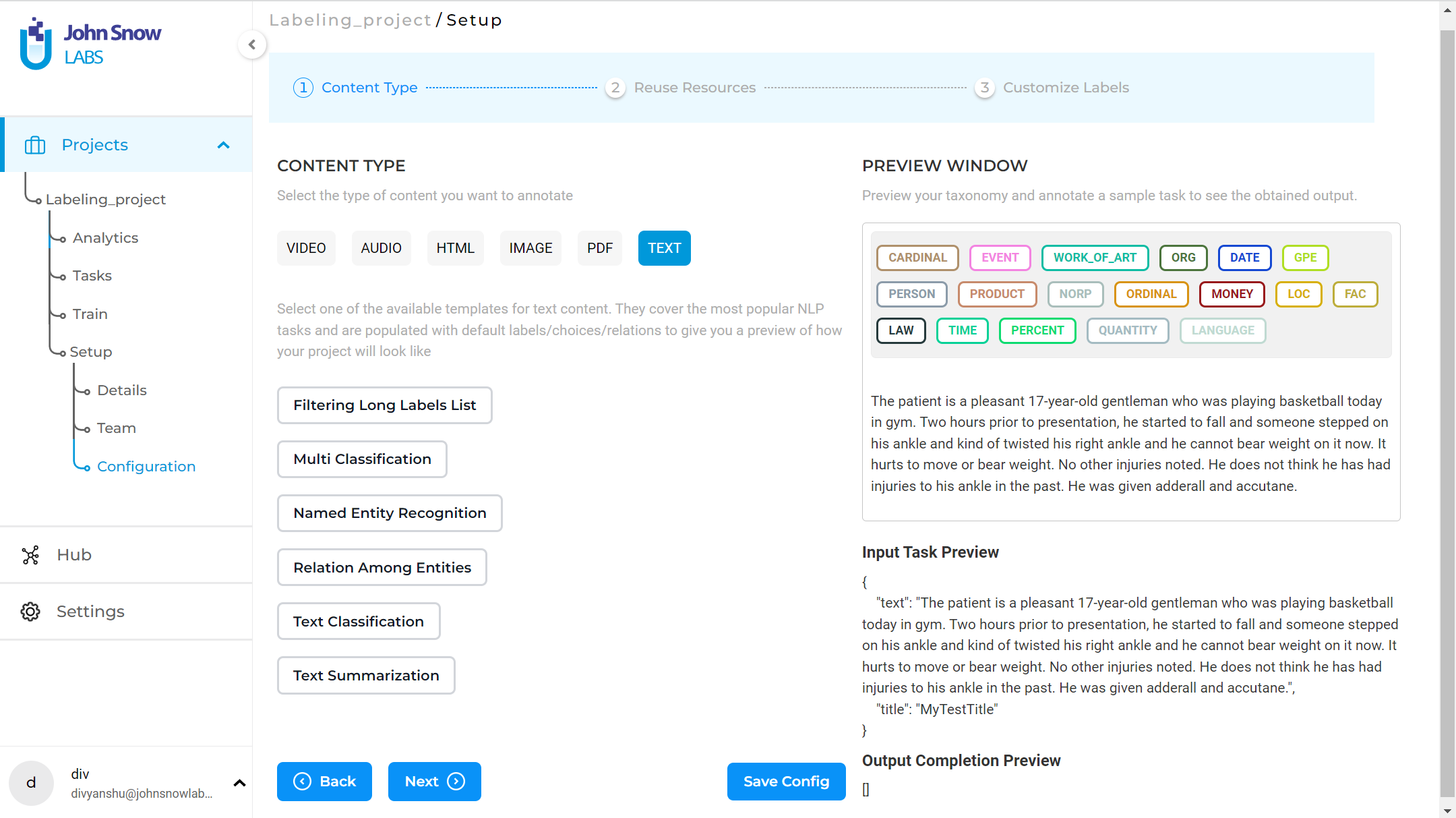
The first step when creating a new project or customizing an existing one is to choose what content you need to annotate. The following content types are supported: Video, Audio, HTML, Image, PDF, and Text. For each content type, a list of available templates is shown. You can pick any one of those as a starting point in your project configuration.
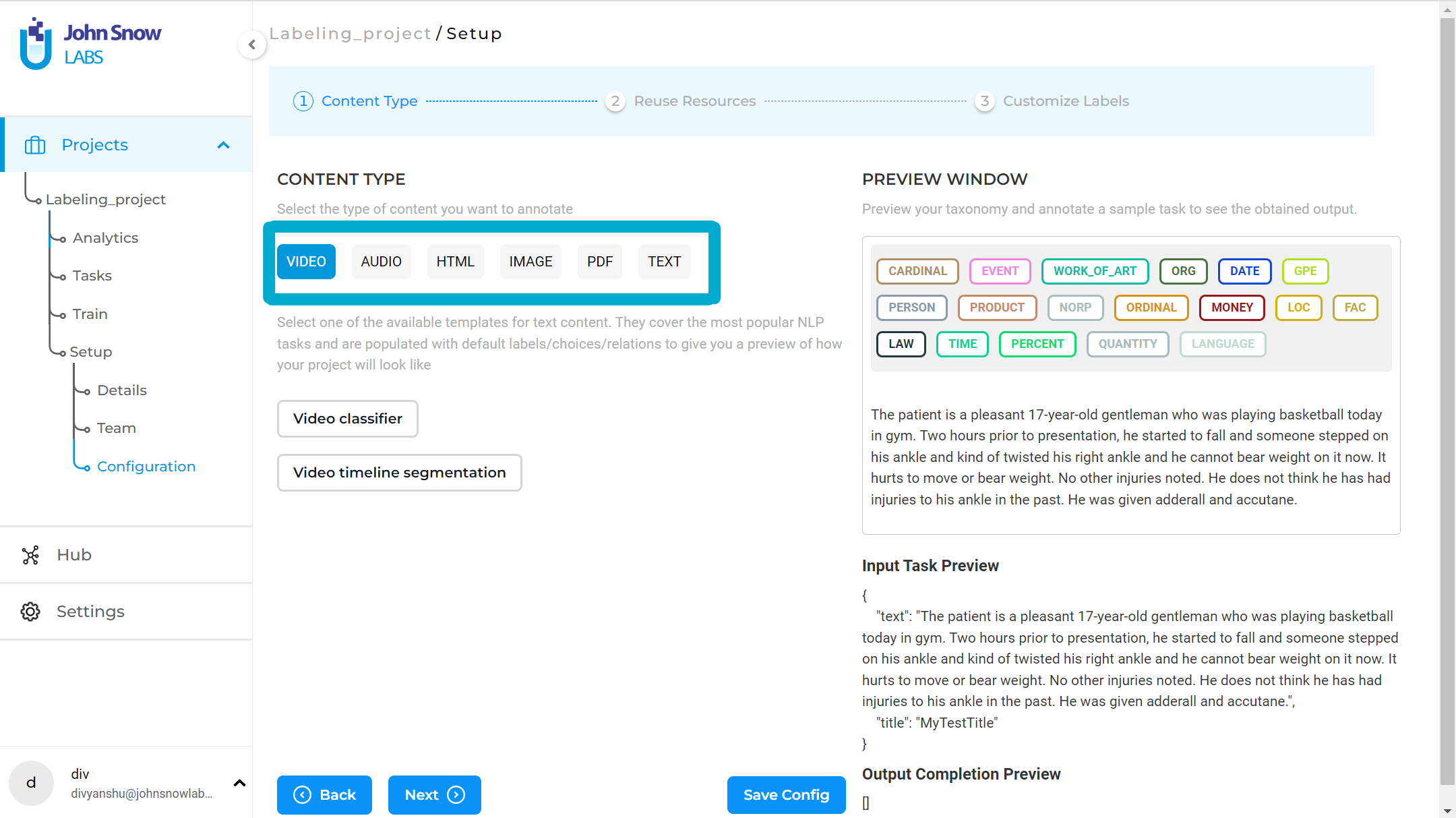
For customizing a predefined configuration, choose a Content Type and then a template from the list. Then navigate to the Customize Labels tab and manually edit/update the configuration to contain the labels you need.
Users can add custom labels and choices in the project configuration from the Visual tab for both text and Visual NER projects.

After you finish editing the labels click the “Save” button.
Note: Some resource combinations are not supported. For example, Visual NER projects do not support adding Rules or External Classification Prompts. The interface disables these options to prevent invalid configurations.
Named Entity Recognition
Named Entity Recognition (NER) refers to the identification and classification of entities mentioned in unstructured text into pre-defined categories such as person names, organizations, locations, medical codes, time expressions, quantities, monetary values, percentages, etc.
The Generative AI Lab offers support for two types of labels:
- Simple labels for NER or assertion models;
- Binary relations for relation extraction models.
Assertion Labels
The syntax for defining an Assertion Status label is the same as for the NER labels, with an additional attribute - assertion which should be set to true (see example below). This convention is defined by Generative AI Lab users which we exploited for identifying the labels to include in the training and prediction of Assertion Models. A simple Labeling Config with Assertion Status defined should look like the following:
<View>
<Labels name="ner" toName="text">
	<Label value="Medicine" background="orange" hotkey="_"/>
	<Label value="Condition" background="orange" hotkey="_"/>
	<Label value="Procedure" background="green" hotkey="8"/>
	<Label value="Absent" assertion="true" background="red" hotkey="Z"/>
	<Label value="Past" assertion="true" background="red" hotkey="X"/>
</Labels>
<View style="height: 250px; overflow: auto;">
	<Text name="text" value="$text"/>
</View>
</View>
NOTE: Notice assertion=”true” in Absent and Past labels, which marks each of those labels as Assertion Status Labels.
Classification
The choices tag is used as part of the classification projects to create a group of choices. It can be used for a single or multiple-class classification. According to the parameters used along with the choices tag, annotators can select single or multiple choices.
Parameters
The Choices tag supports the following parameters/attributes:
| Param | Type | Default | Description |
|---|---|---|---|
| required | boolean |
false |
Verify if a choice is selected |
| requiredMessage | string |
Show a message if the required validation fails | |
| choice | single | multiple |
single |
Allow user to select single or multiple answer |
| showInline | boolean |
false |
Show choices in a single visual line |
| perRegion | boolean |
Use this attribute to select an option for a specific region rather than the entire task |
<!--text classification labeling config-->
<View>
  <Text name="text" value="$text"/>
  <Choices name="surprise" toName="text" choice="single" required='true' requiredMessage='Please select choice'>
    <Choice value="surprise"/>
    <Choice value="sadness"/>
    <Choice value="fear"/>
    <Choice value="joy"/>
  </Choices>
</View>

When using the perRegion attribute, choices can be defined for each chunk annotation as shown below:

Relation Extraction
Generative AI Lab also offers support for relation extraction. Relations are introduced by simply specifying their label in the project configuration.
<Relations>
    <Relation value="CancerSize" />
    <Relation value="CancerLocation"/>
    <Relation value="MetastasisLocation"/>
  </Relations>
Constraints for relation labeling
While annotating projects with Relations between Entities, defining constraints (the direction, the domain, the co-domain) of relations is important. Generative AI Lab offers a way to define such constraints by editing the Project Configuration. The Project Owner or Project Managers can specify which Relation needs to be bound to which Labels and in which direction. This will hide some Relations in Labeling Page for NER Labels which will simplify the annotation process and will avoid the creation of any incorrect relations in the scope of the project.
To define such constraint, add allowed attribute to the
- L1>L2 means Relation can be created in the direction from Label L1 to Label L2, but not the other way around
- L1<>L2 means Relation can be created in either direction between Label L1 to Label L2
If the allowed attribute is not present in the tag, there is no such restriction.
Below you can find a sample Project Configuration with constraints for Relation Labels:
<View>
<Header value="Sample Project Configuration for Relations Annotation"/>
<Relations>
    <Relation value="Was In" allowed="PERSON>LOC"/>
    <Relation value="Has Function" allowed="LOC>EVENT,PERSON>MEDICINE"/>
    <Relation value="Involved In" allowed="PERSON<>EVENT"/>
    <Relation value="No Constraints"/>
</Relations>
<Labels name="label" toName="text">
    <Label value="PERSON"/>
    <Label value="EVENT"/>
    <Label value="MEDICINE"/>
    <Label value="LOC"/>
</Labels>
<Text name="text" value="$text"/>
</View>
Using the Visual Menu Editor
With the Visual Menu Builder, users can easily create, edit, and manage project configurations through a user-friendly interface without the need to understand XML as demonstrated above. This makes the configuration process much more straightforward, especially for those unfamiliar with XML syntax, while also reducing the risk of errors associated with manual coding.
To see the structure of a project configuration XML file and the definitions of the supported tag types and various parameters and variables, and to better understand how Visual Menu Builder maps and creates these elements when configuring your project, see Project Configuration Overview.
Key Features:
Add New Element
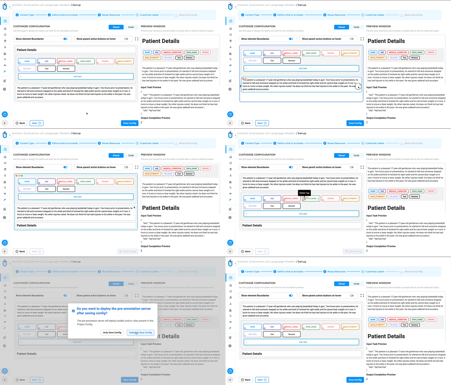
The menu user interface allows users to easily add new elements to their project configurations. Users can click on the plus icon (“+”) within the Visual Menu Builder interface to add a new element. Once the element is added, users can further customize it by configuring additional parameters directly in the interface. This might include setting attributes, defining properties, or linking to other project components.
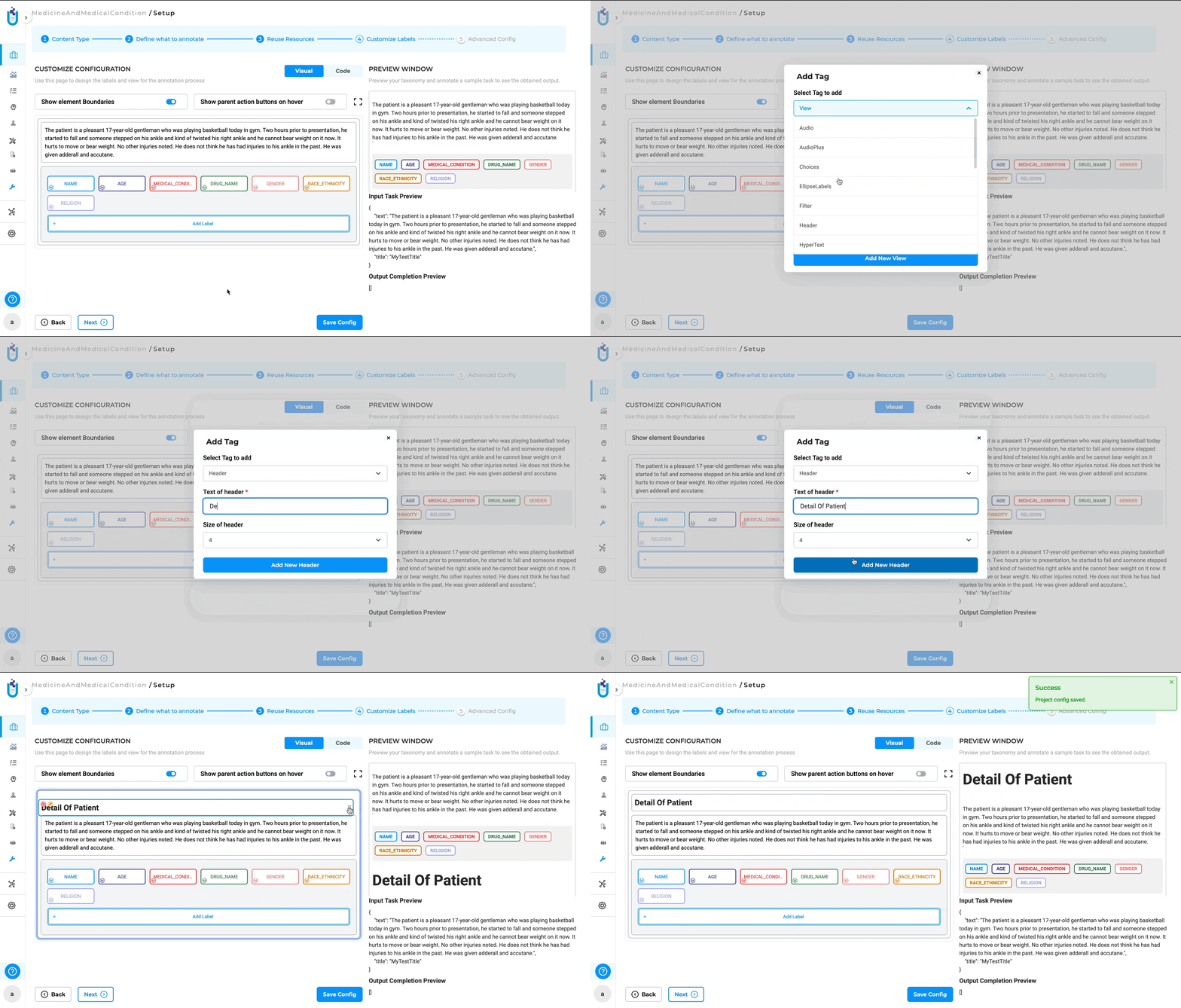
Edit an Element
Users can modify the properties and configurations of existing elements within the project. By clicking on the edit icon (a pencil icon), users can access the settings for an existing element. This opens an editable interface where users can adjust the element’s parameters to suit the evolving needs of the project.

Delete an Element
Users can remove unwanted elements from the project configuration. Users can click on the cross button (“x”) associated with a specific element to remove it from the project. This feature helps in keeping the project configuration clean and relevant by allowing users to easily remove elements that are no longer needed.
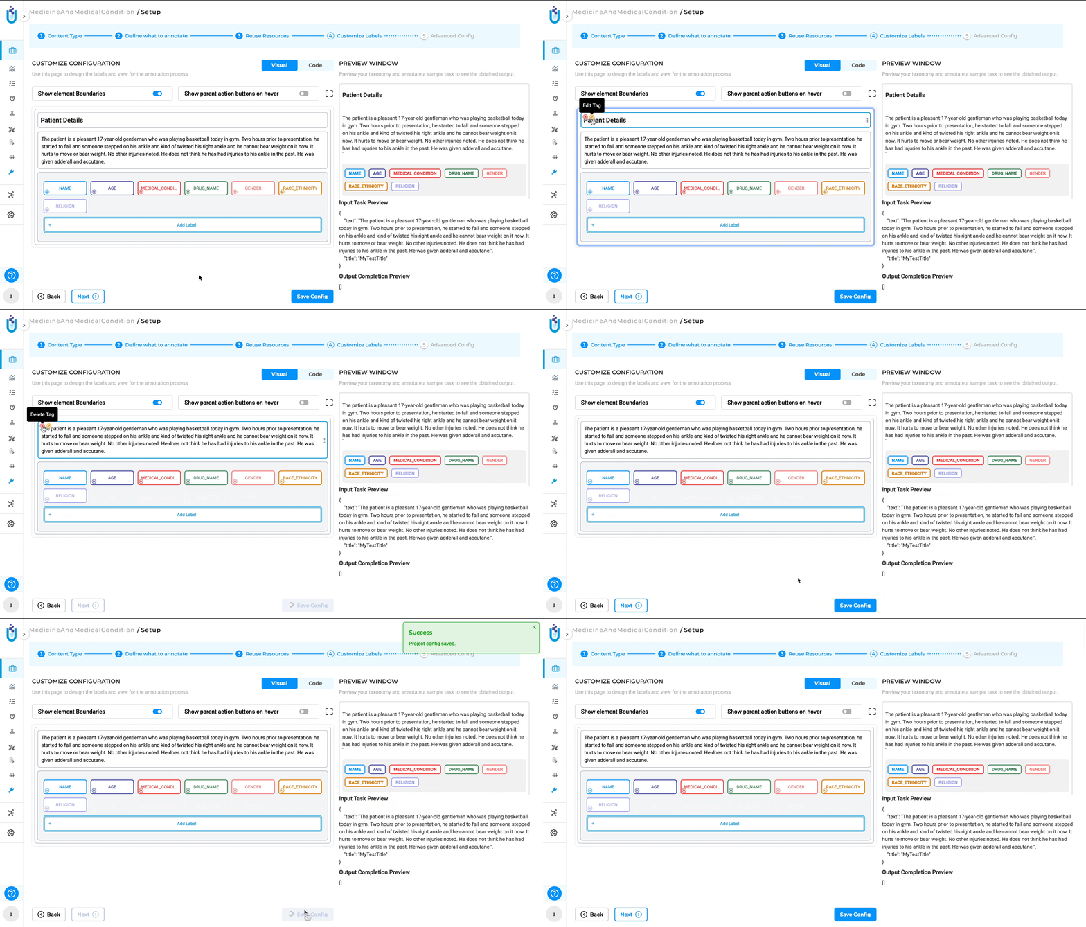
Drag and Move Element
The visual menu builder allows users to easily rearrange elements within the project configuration using a drag-and-drop interface. To move an element, users can click and hold on the “Handle” icon, which is represented by a set of six dots (three parallel dots in two vertical rows) next to the element. After clicking on the Handle, users can drag the element to the desired position within the project configuration. Release the mouse button to drop the element in its new location. This feature provides flexibility in organizing the project structure, allowing users to quickly and intuitively reorder elements.
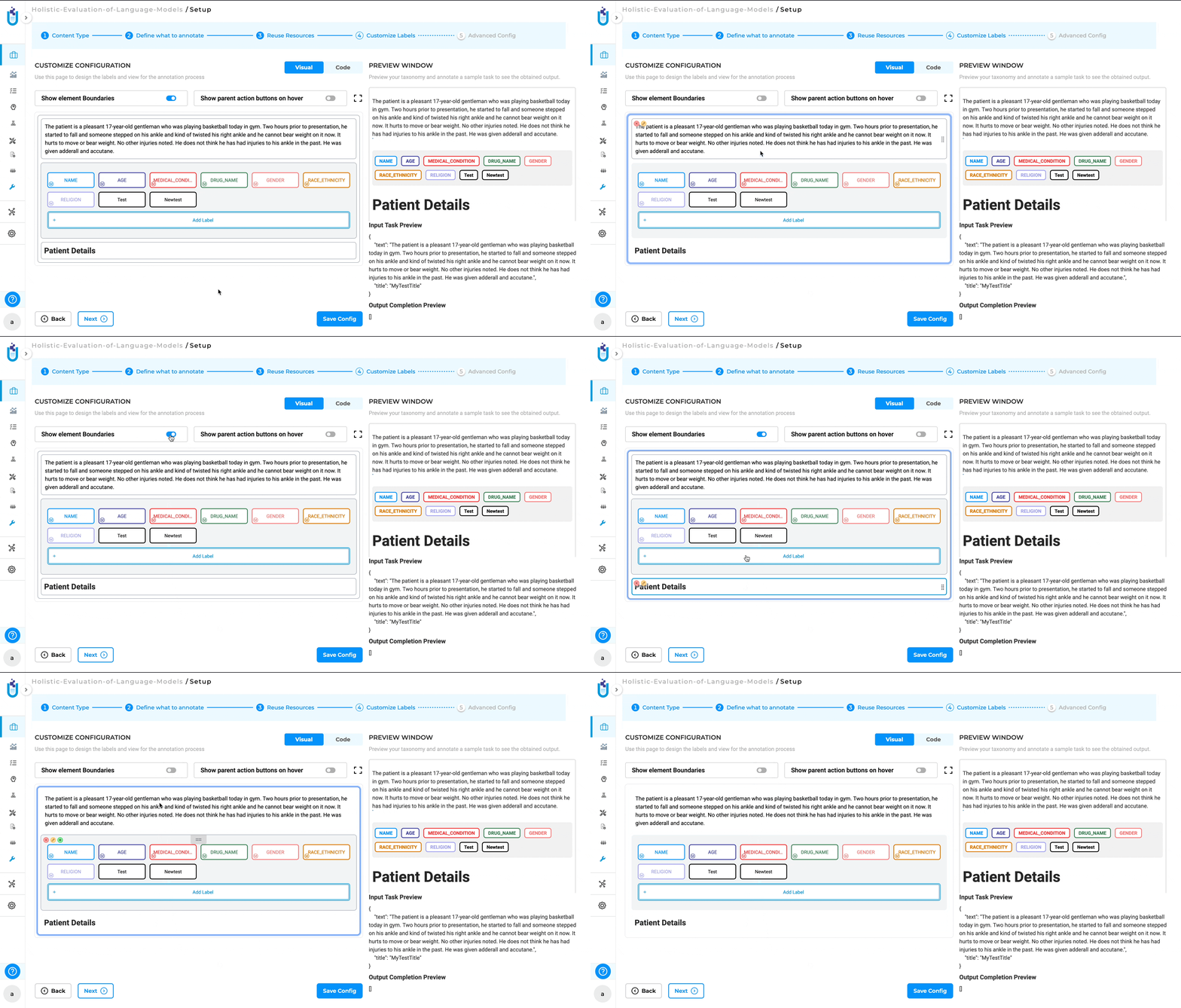
Show Element Boundaries
The Show element Boundaries button in the visual menu builder highlights the borders of each element within the project configuration, making it easier to visualize and distinguish the different components. By clicking on the “Show element Boundaries” button, users can toggle the visibility of the boundaries for all elements in the configuration. When enabled, a visible border will appear around each element, clearly outlining its scope and separation from other elements. This feature is particularly helpful when working with complex configurations where multiple elements are closely positioned. By showing the boundaries, users can easily identify and select the correct element they want to edit, move, or delete.
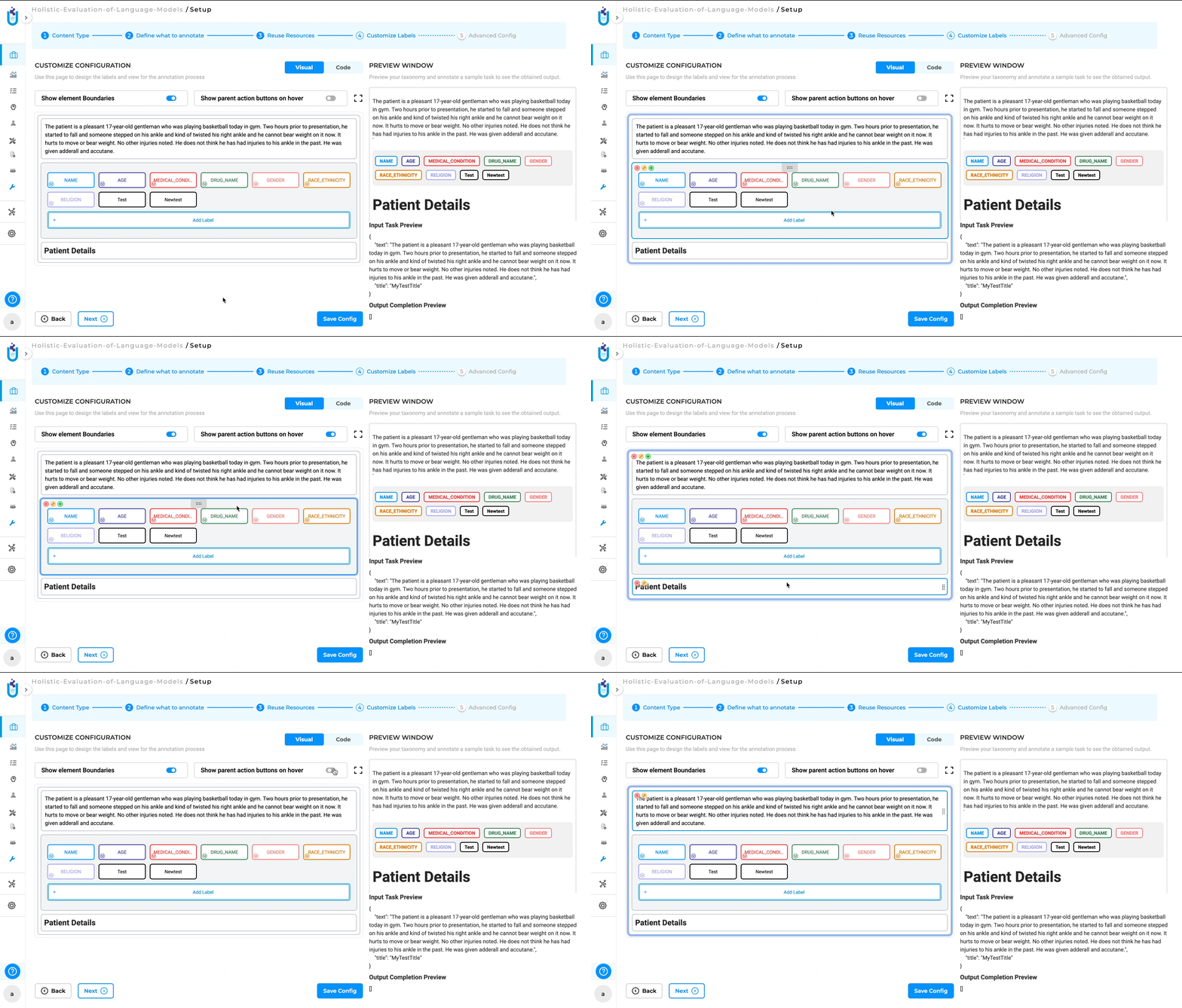
Show Parent Action Buttons on Hover
The Show parent action buttons on hover button in the Visual Menu Builder allows users to quickly access action buttons (such as edit, delete, or add) for parent elements by hovering over them. By hiding the action buttons until needed, it reduces visual clutter and allows users to concentrate on their current tasks. The ability to quickly access these buttons by hovering ensures that they remain easily accessible without overwhelming the interface.
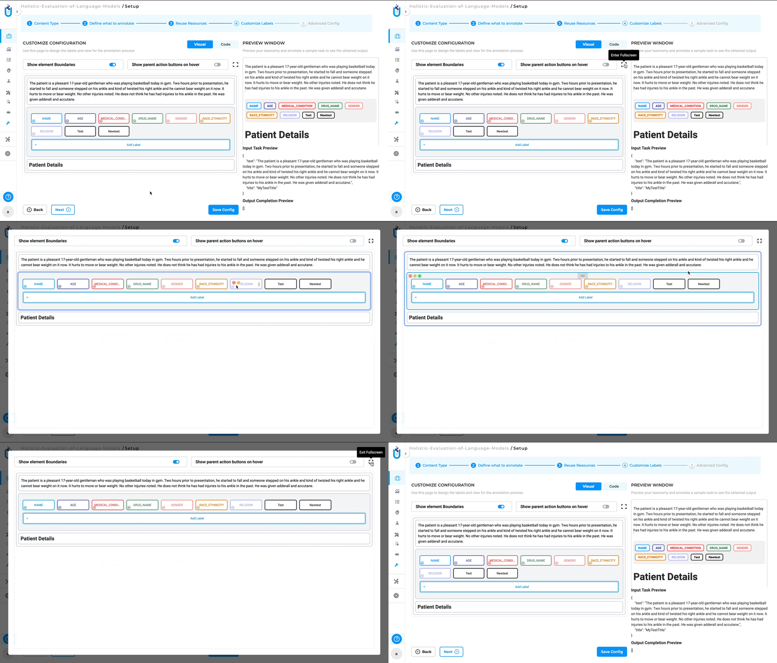
Fullscreen Mode
The “Fullscreen” button in the visual menu builder allows users to expand the workspace to occupy the entire screen, providing a larger and more focused view of the project configuration. Clicking on the “Fullscreen” button maximizes the Visual Menu Builder, hiding other UI elements so the entire screen is dedicated to the project configuration. To exit fullscreen mode, users can click the “Fullscreen” button again or use the Esc key to return to the normal view with all standard UI elements visible.
The Visual Menu Builder automatically validates structure and prevents saving malformed configurations, ensuring projects remain compatible with supported annotation types and pre-annotation workflows.